Game Golf
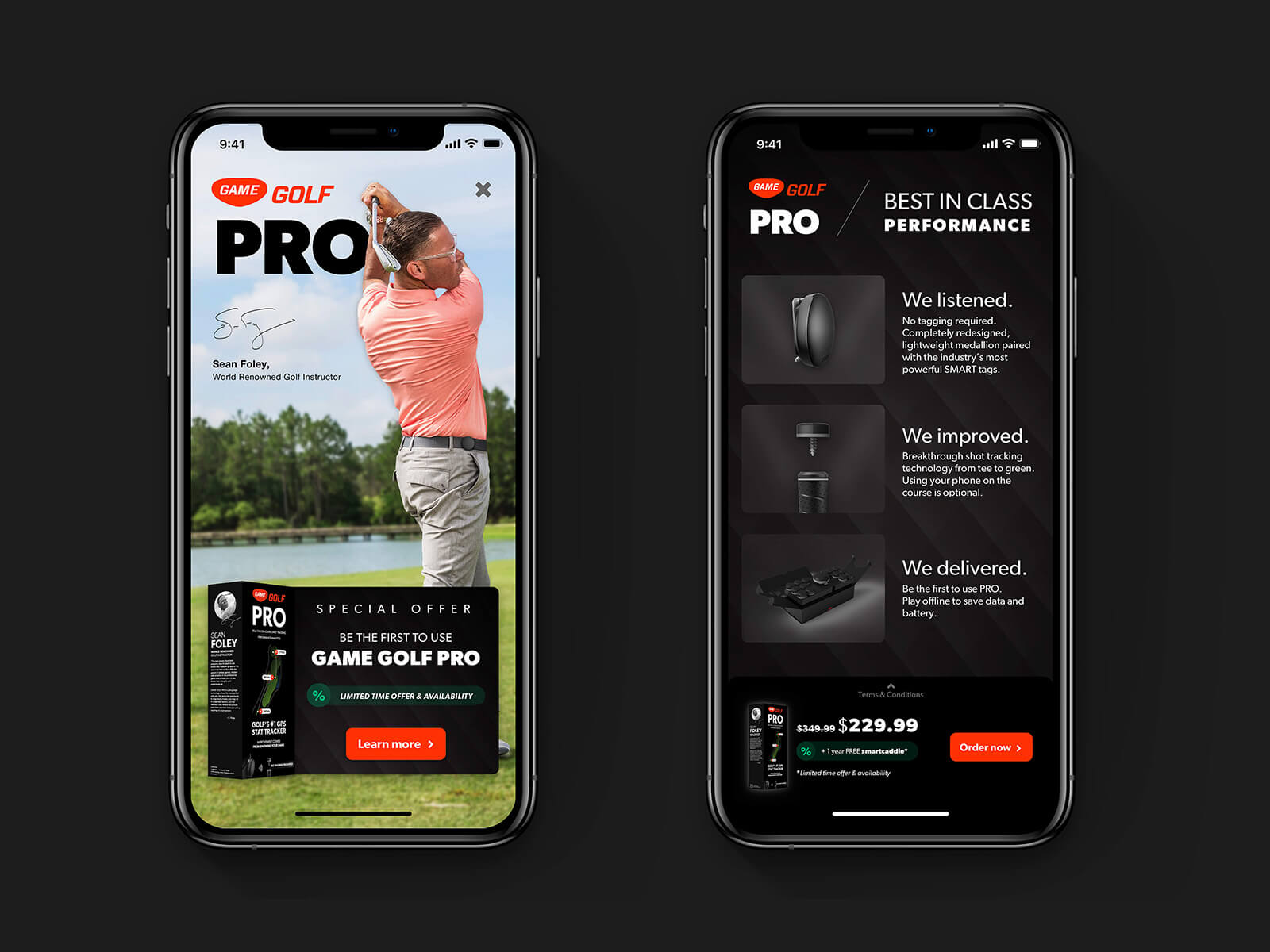
As part of Eskild Hansen Design Studio we were approached by smart sensor industry leader in golfing Game Golf to help them create a digital experience for their new line of hardware products, used by President Obama among others.
I worked closely and fully integrated with their development, management and hardware teams.
Role
Product Designer
Contribution
App, Web design, Style Guide
Industry
Sports tech, AI
Year
2018-2019
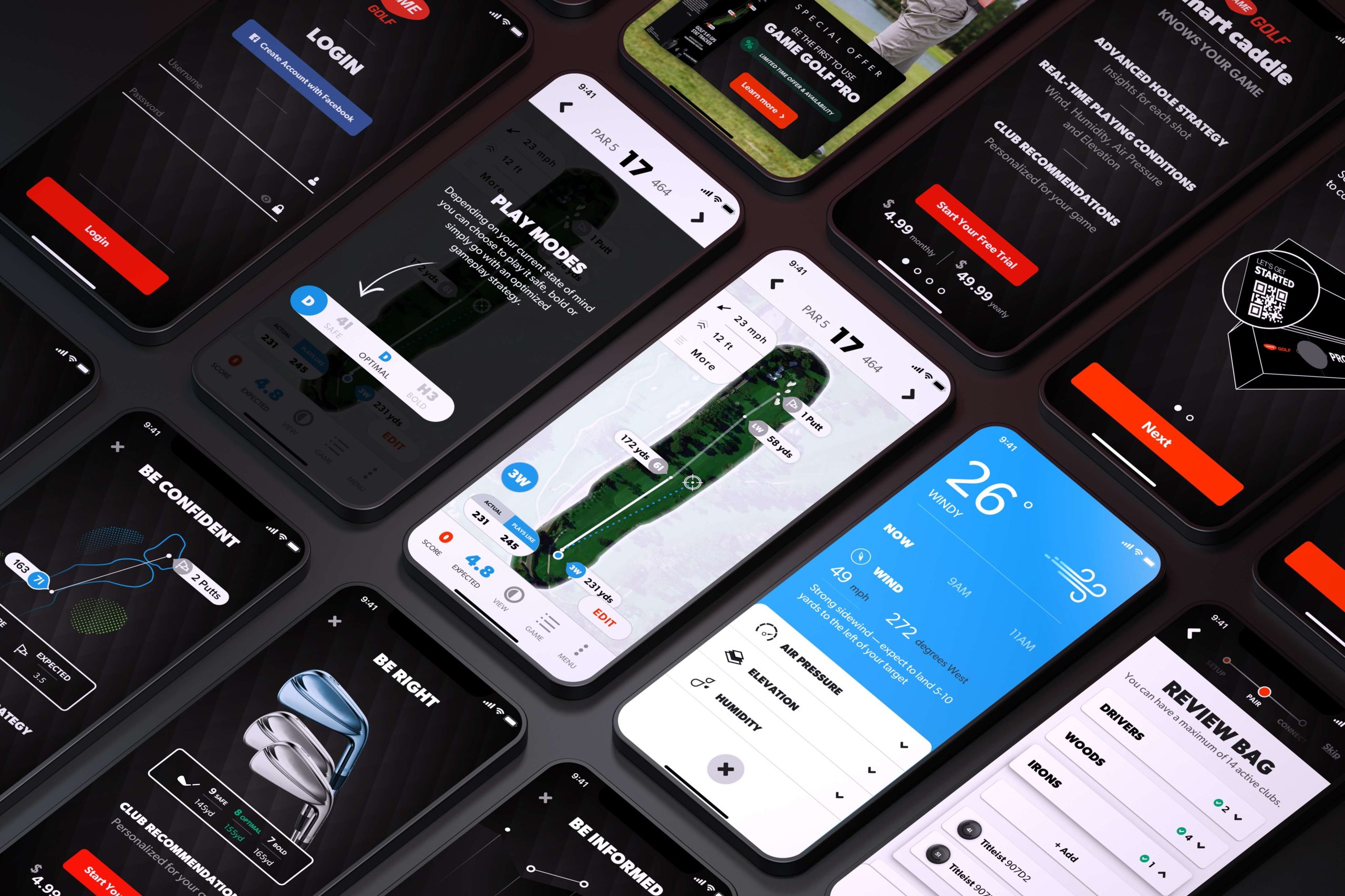
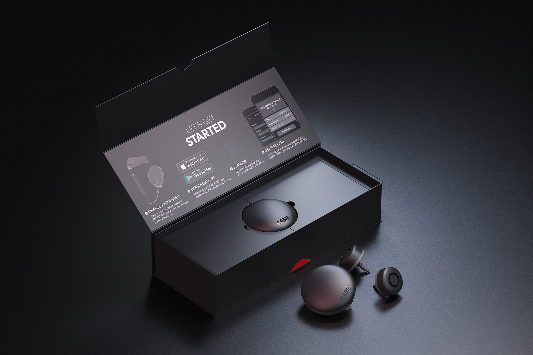
14 tags that attach to your golf clubs.
1 device that attaches to your belt.
1 app that controls everything during the game.
GAME GOLF is a smart golf tracker. It changes how golfers and instructors around the world use data to improve on-course performance through machine learning and AI. Since its introduction in 2014, GAME Golf has been used in 135+ countries, with over 36,000 courses mapped, over 3 million rounds played, and 300+ million shots tracked.
Understanding the brief. At the time, the company had already established itself as a strong player (no put intended) in the golf community. That meant that in order for me to design a meaningful solution, I needed to understand the Who, the What & the Why behind the product and brand—and inherently the challenge itself. Along with the in's and out's of playing golf in itself.
The What—or how does success look like
Design for a holistic digital experience through mobile, web and watch apps, that accommodates for a new line of hardware products.
The Why—or why is this a problem today
✕ Lack of support for a new line of hardware products
✕ Dead ends in the user journey
✕ Unintuitive interactions
✕ Limited brand visibility
The Who—or who is this product for
Professional and amateur golf players worldwide, looking to improve their score.
How Might We create a digital experience that allows users to
Easily get onboarded and set up the smart devices
Manage & configure devices across multiple platforms
Experience a coherent brand alignment across different mediums
Onboarding
Old
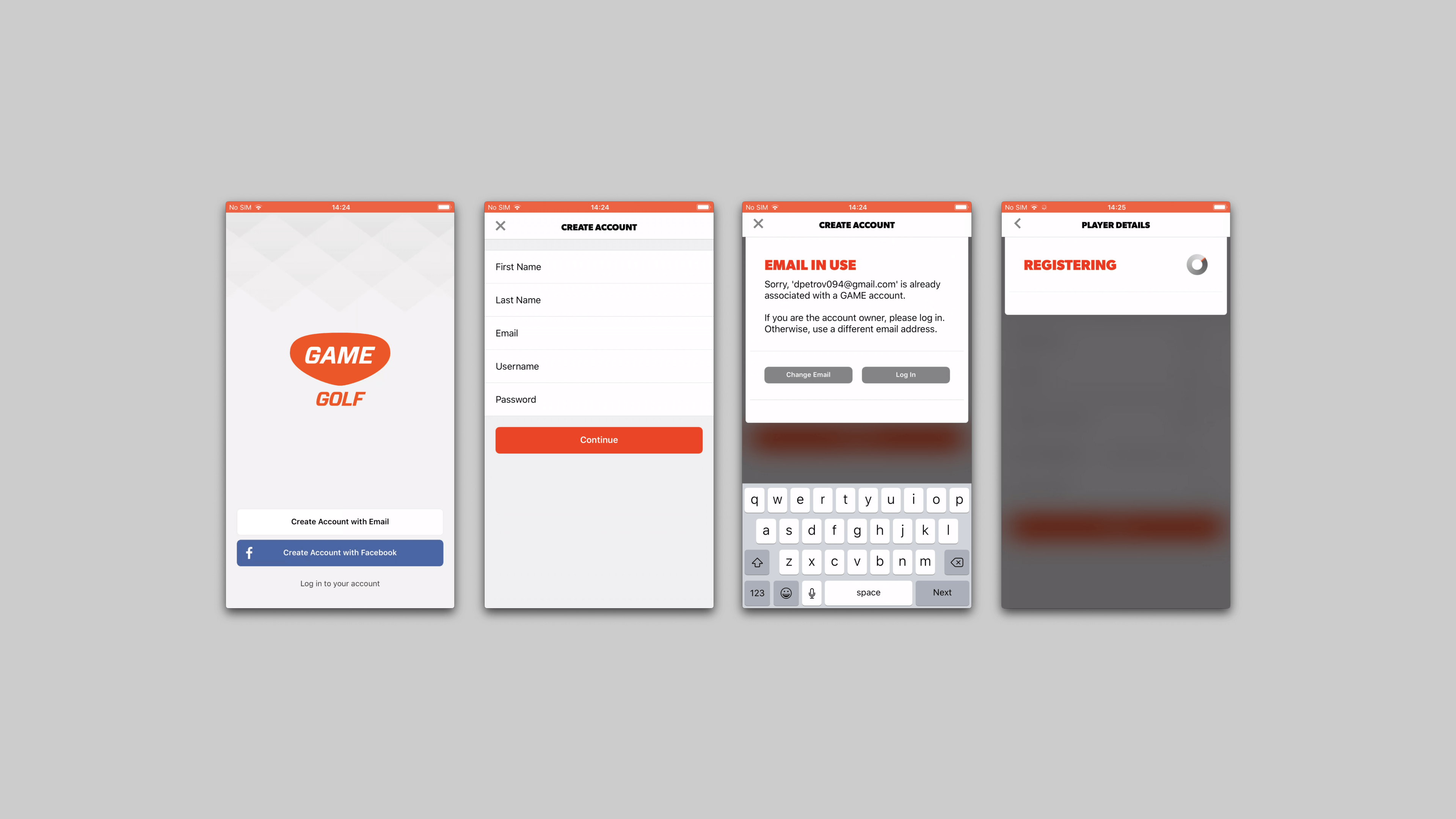
Pain points
✕ Limited brand visibility
✕ No clear guidance
✕ No access to Help Center
✕ Field validation after the fact
✕ No support for new devices
New
Multi-platform onboarding + Tighter brand alignment
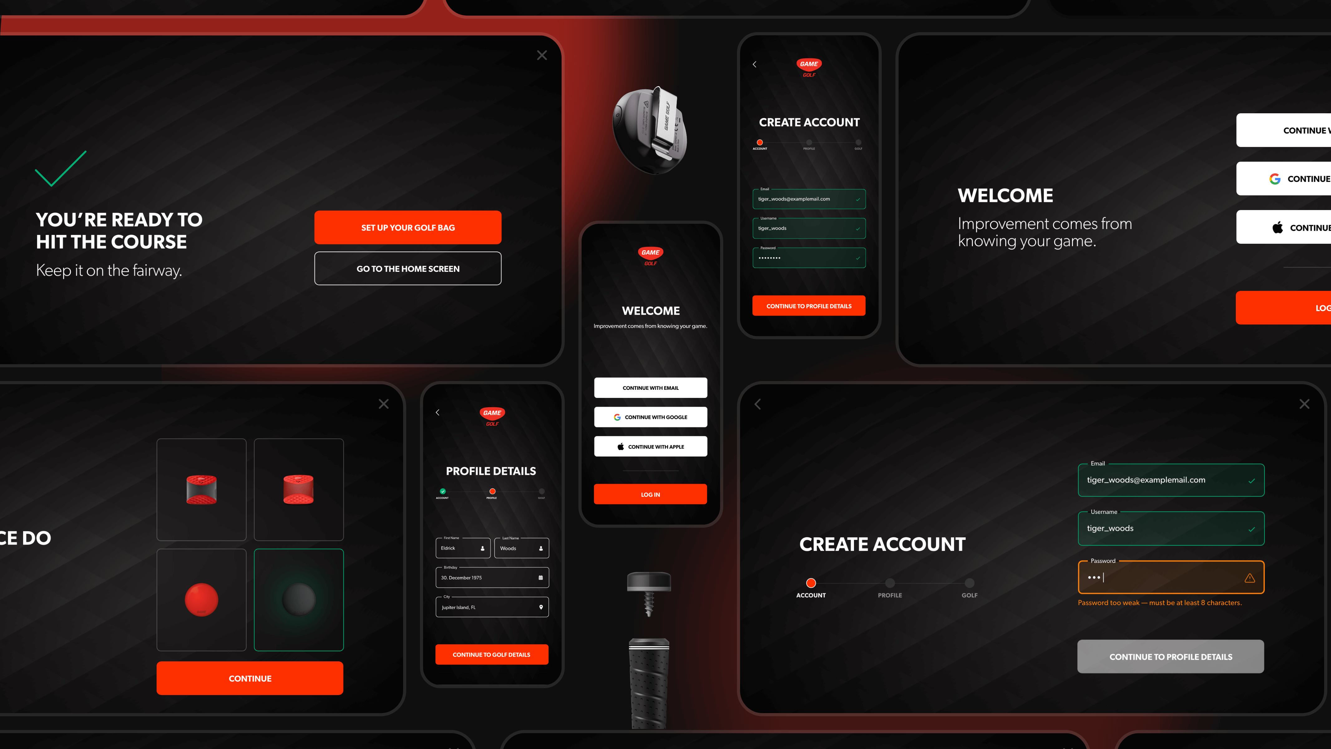
Contextual validation
Instead of forcing the user to first click the "Continue" button — and realize he's made a mistake in one of the fields after the fact — we wanted to inform him of any mistypes right away by contextually validating every field on the go.
Meaningful interactions
One of the bigger pain points we found when interviewing existing users, was that they were presented with many different types of doing the same action across different places in the software.
So in an effort to address that — we created a set of visual interactions (part of a new style guide, see later) that provide value while staying on brand.
Setting up the devices. A key challenge in the brief was that the new line of devices would require the user to pair all 14 tags manually one-by-one through the app. This would add implications to the current onboarding flow, so a new flow was created from the ground up to accommodate the new devices requirements and preserve backwards compatibility for older devices.

Simple multi-step setup
To ensure an easy to understand and simple setup experience, we distilled the setup flow into only 3 parts - Pair, Add clubs and Connect. With the help of the GD team, we also created custom illustrations that portray each step's physical touchpoint. The intention is to prepare the user for what the next step is about.
→ We found out that having more steps with less cognitive load resulted in a faster experience, than the other way around. That's why we spent a fair amount of time finding the right balance between number of steps and must-have steps.
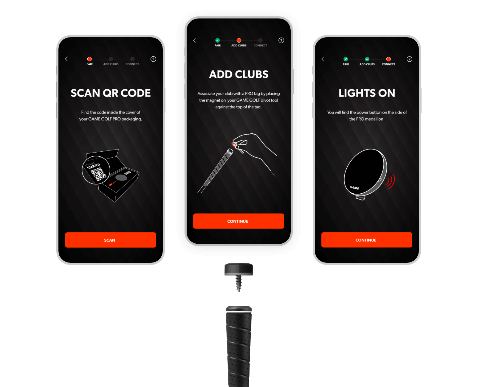
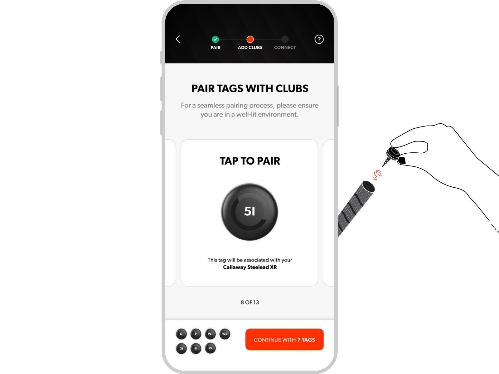
From the get-go, we knew we wanted to design for an honest and straightforward setup experience
We knew we only had one chance to make sure the user is left with a good first impression(experience). So we aimed to make the pairing experience between hardware and software as humanly and close to real life as possible — through thoughtful copy and as little cognitive load as possible.
Always holding the user’s hand
We designed for a supportive experience at all times. We did that through adding a sense of state per user executed action (e.g. success/error snackbars), pinned help buttons on all screens, error states, followed by guidance via resolution paths.
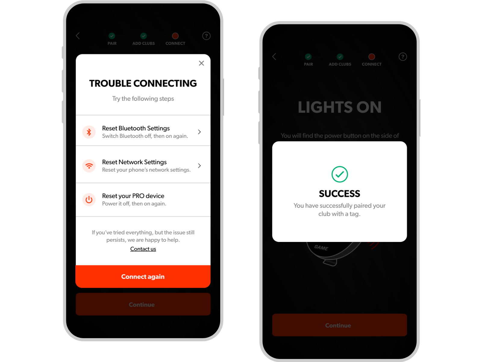
Made it easier for devs & designers involved. Apart from working closely together with different teams across 3 time zones, it was important to set up a common style guide and a layout grid system—to ensure product development consistency across digital touchpoints.
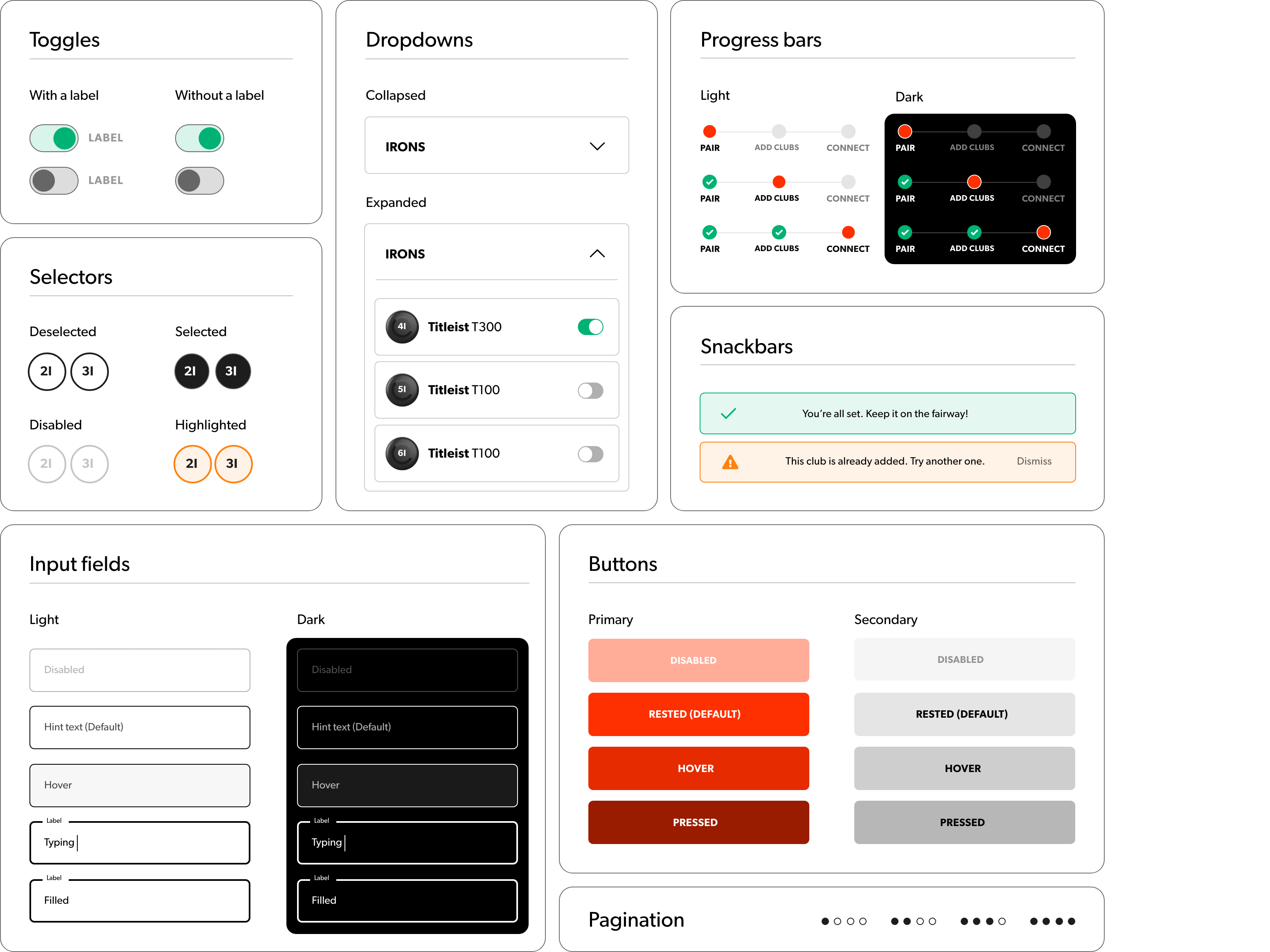
One source-of-truth style guide
To ensure continuity across app and web, we created a set of components that align with the company's brand guidelines. This way we increased dev and design team's collaboration efficiency and set the ground for a minimal (if any) tech debt.
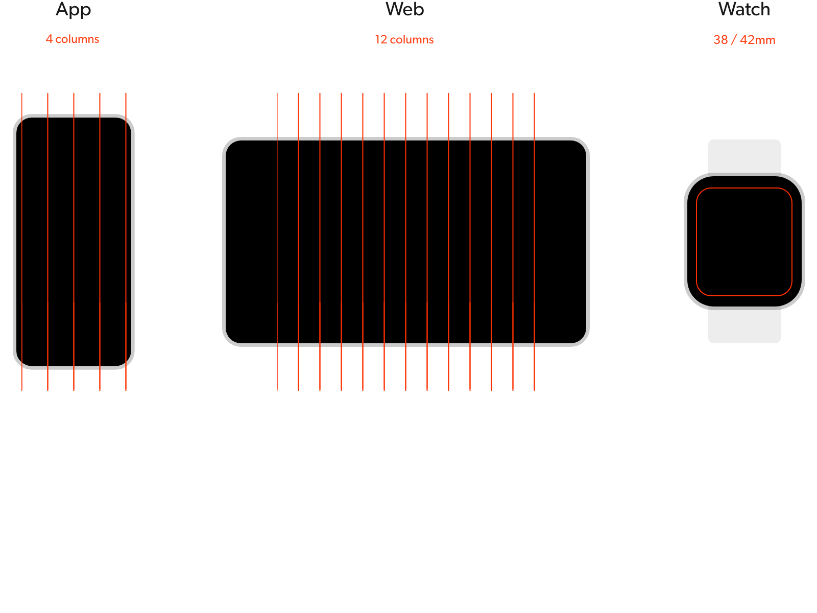
A scalable layout grid system
For a consistent exprience across different platforms, we set up a few layout principles from the get-go. E.g. using an 8pt grid system across.
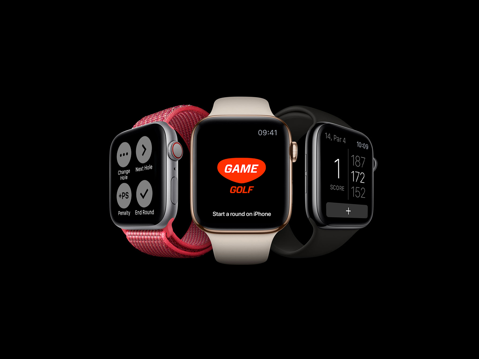
Moreover, to accommodate the designs for both iOS, Android and Watch screen sizes, we used common practices from Apple's iOS & WatchOS HIG and Google's Material guidelines.
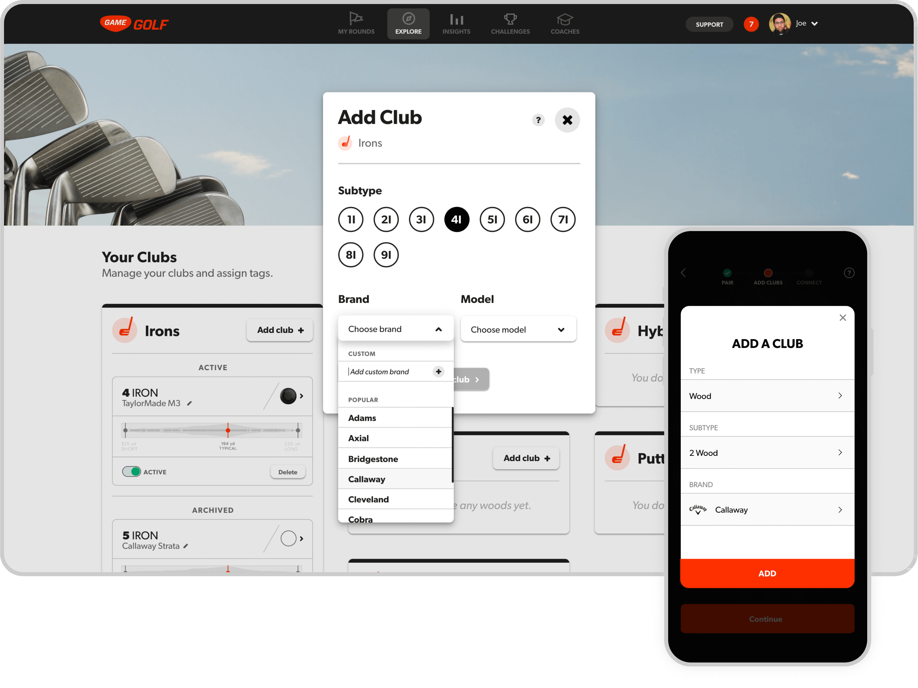
After the onboarding an setup experience, we focused on designing the experience for managing devices across web & app. The Golf bag page is the place to add, remove and re-assign devices to clubs.
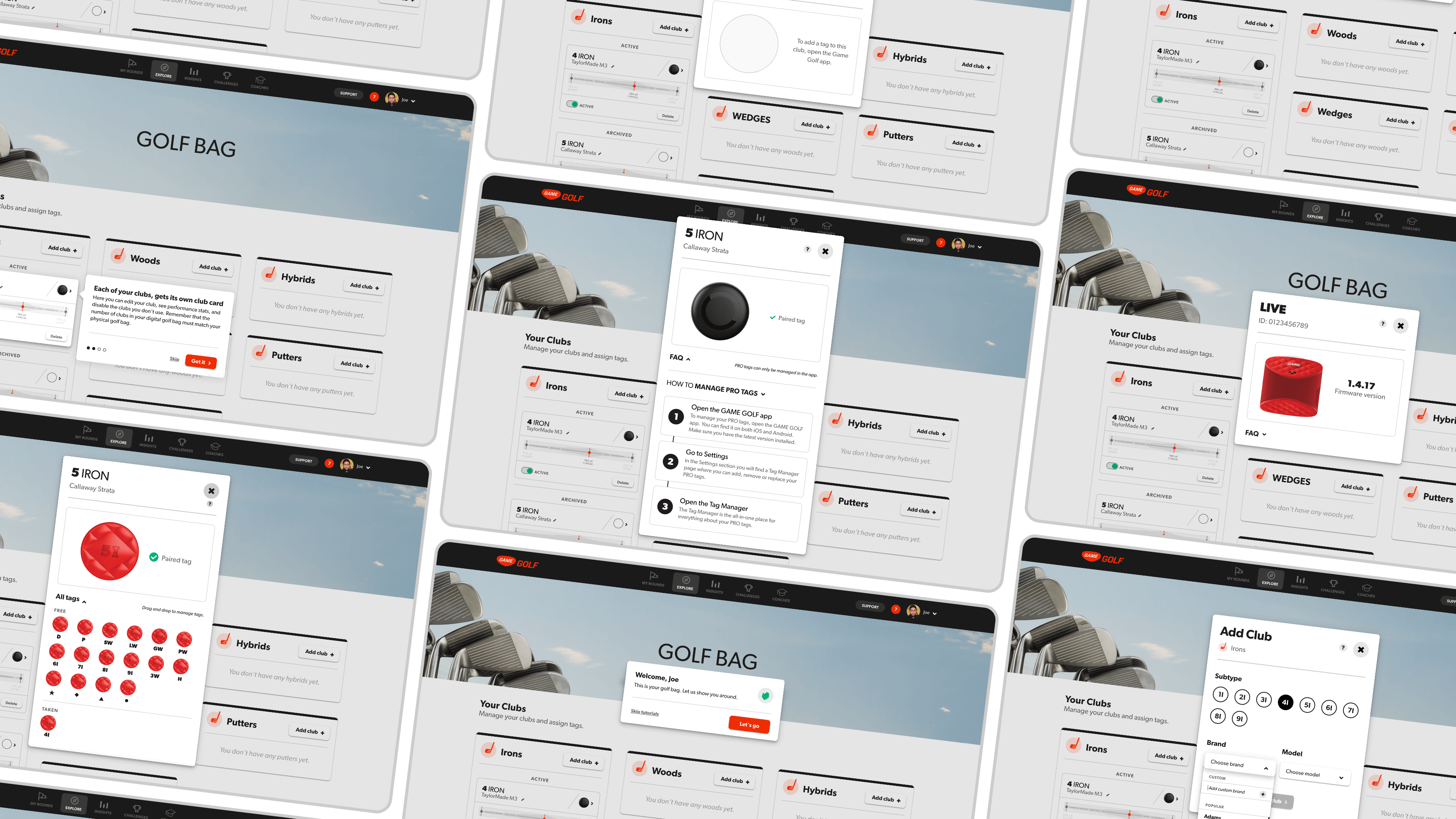
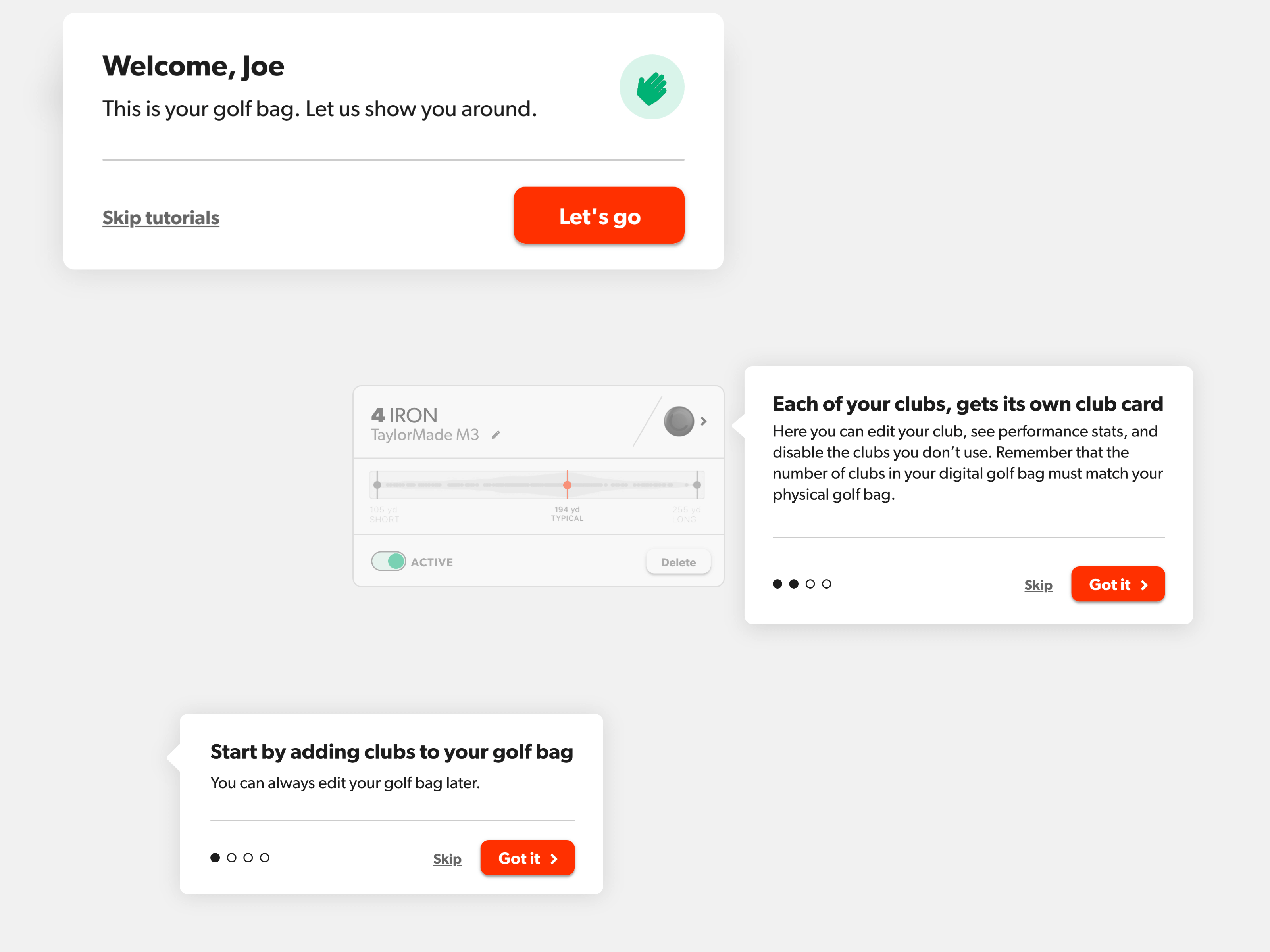
Welcome tutorials
After completing signing up on the web, we wanted to create an easy transition to the product for new users. To do so, we created a set of quick tutorials, aimed to get the user started by highlighting the key areas of the page.
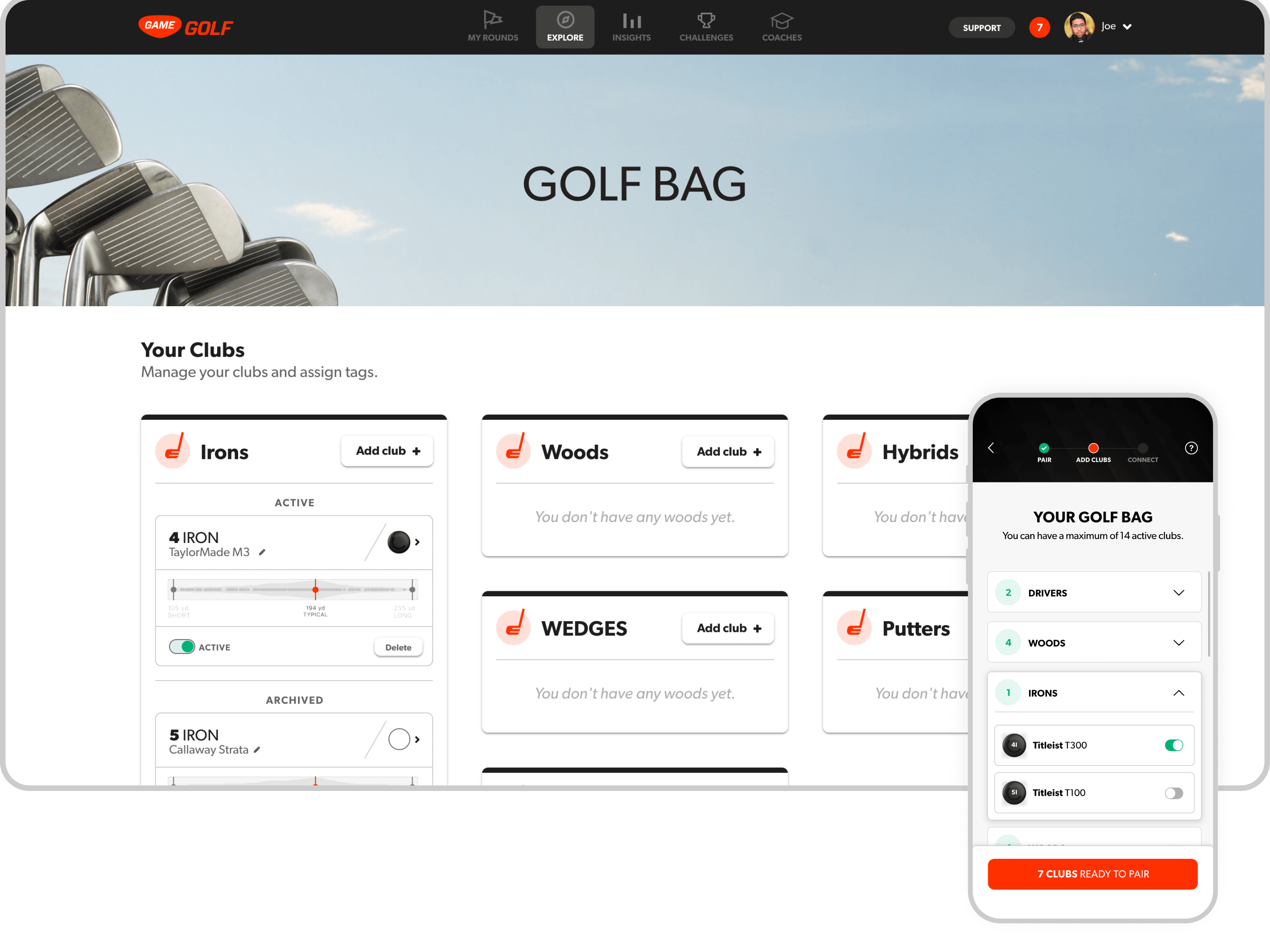
Easy overview of paired clubs
The 'Golf bag' page is the place for users to get an overview of thei r paired devices, add new ones or re-assign the ones they don't use anymore.
Adding clubs
Adding clubs is how users link their clubs to their Game Golf devices.
→ An interesting challenge was that the new line of devices from Game Golf (PRO) could only be linked on the app. To address that, we added an informative page in the web user journey, to guide the user to finish the action on the app.
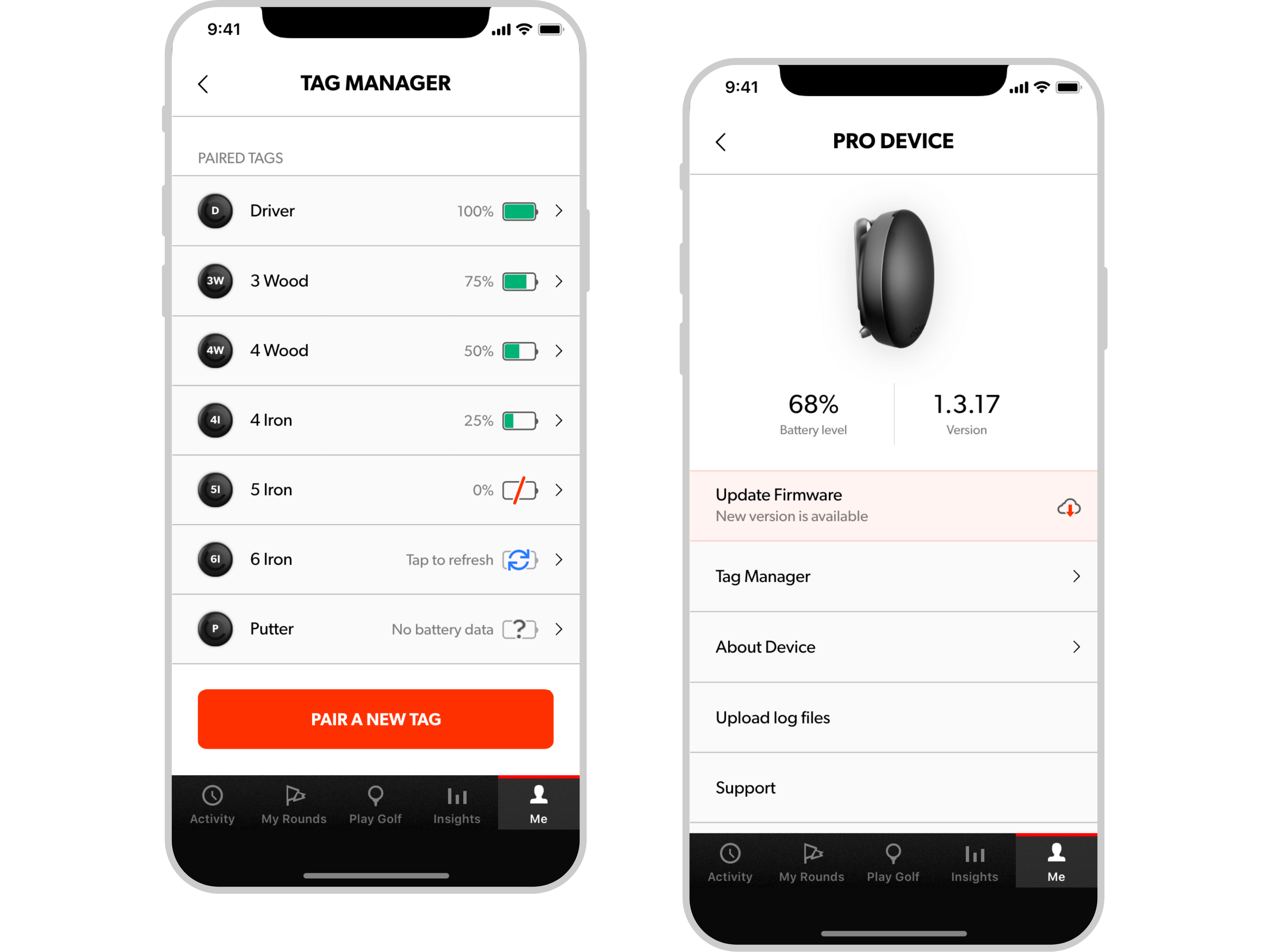
Devices management
In the app, we created devices management pages to help the user navigate through pairing, removing or updating devices.
